All systems go. During the pandemic, something from the past made its way to the present. It made me and my team hopeful about the future, again. It was also a timely reminder of how design helps us imagine and shape better tomorrows.
It was NASA’s 1975 “worm” logo, designed by Danne & Blackburn.
The first time I saw it was when it appeared on the space shuttle, Enterprise, named after the starship from the TV series Star Trek. It was a potent, bold piece of typographic design—an elegant symbol of almost impossible feats of human imagination.
In the early 90’s, it vanished. Scrubbed off everything, forever.
But then, suddenly, it returned. In May, the NASA worm logo was launched again into outer space once, this time with the SpaceX rocket launch.
I reached out to the remarkable, 86 year-old Richard Danne to see if he would speak with us here at COLLINS about his celebrated program. Like so many, we felt trapped in an endless cycle of panic and terrifying stories in the news. What better way, I thought, to regain a sense of optimism than to look up to the stars?
We got lucky. Richard agreed.
So, I hope you enjoy this conversation with Richard Danne and his presentation of his timeless design system and the story behind its creation. As a bonus, Richard reviews some of his other inspiring work, too.
Blast off, indeed.
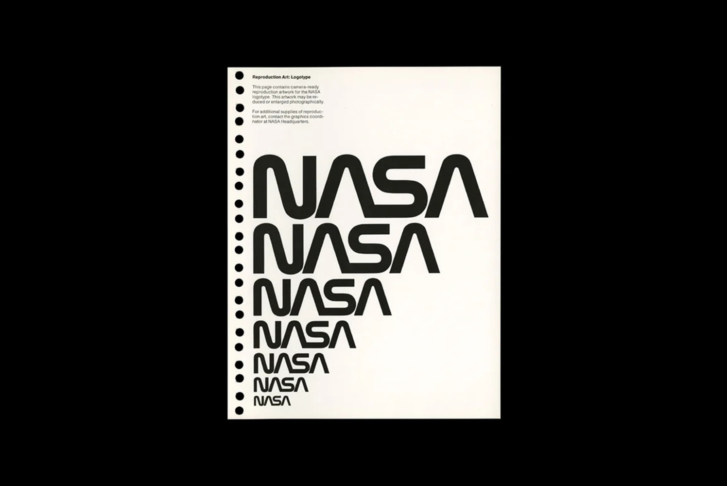
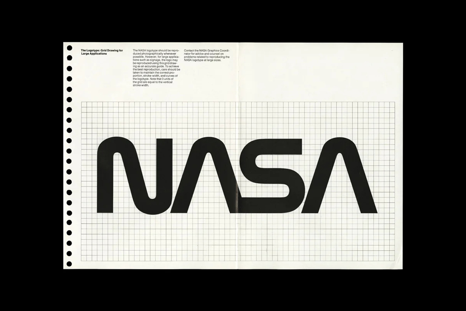
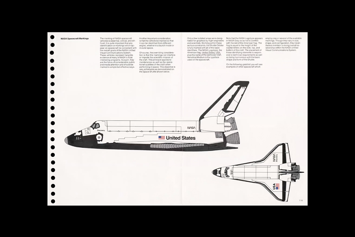
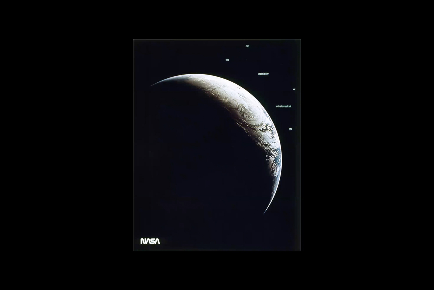
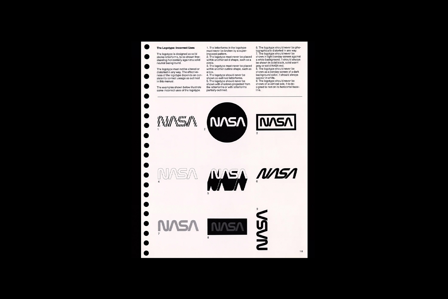
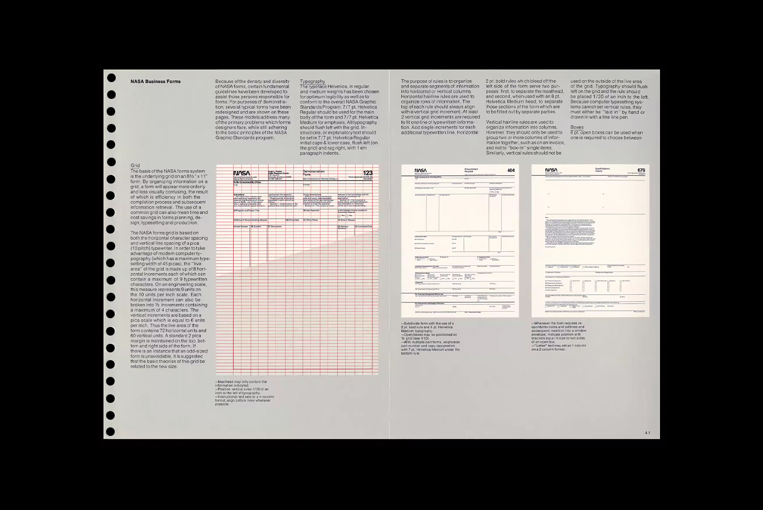
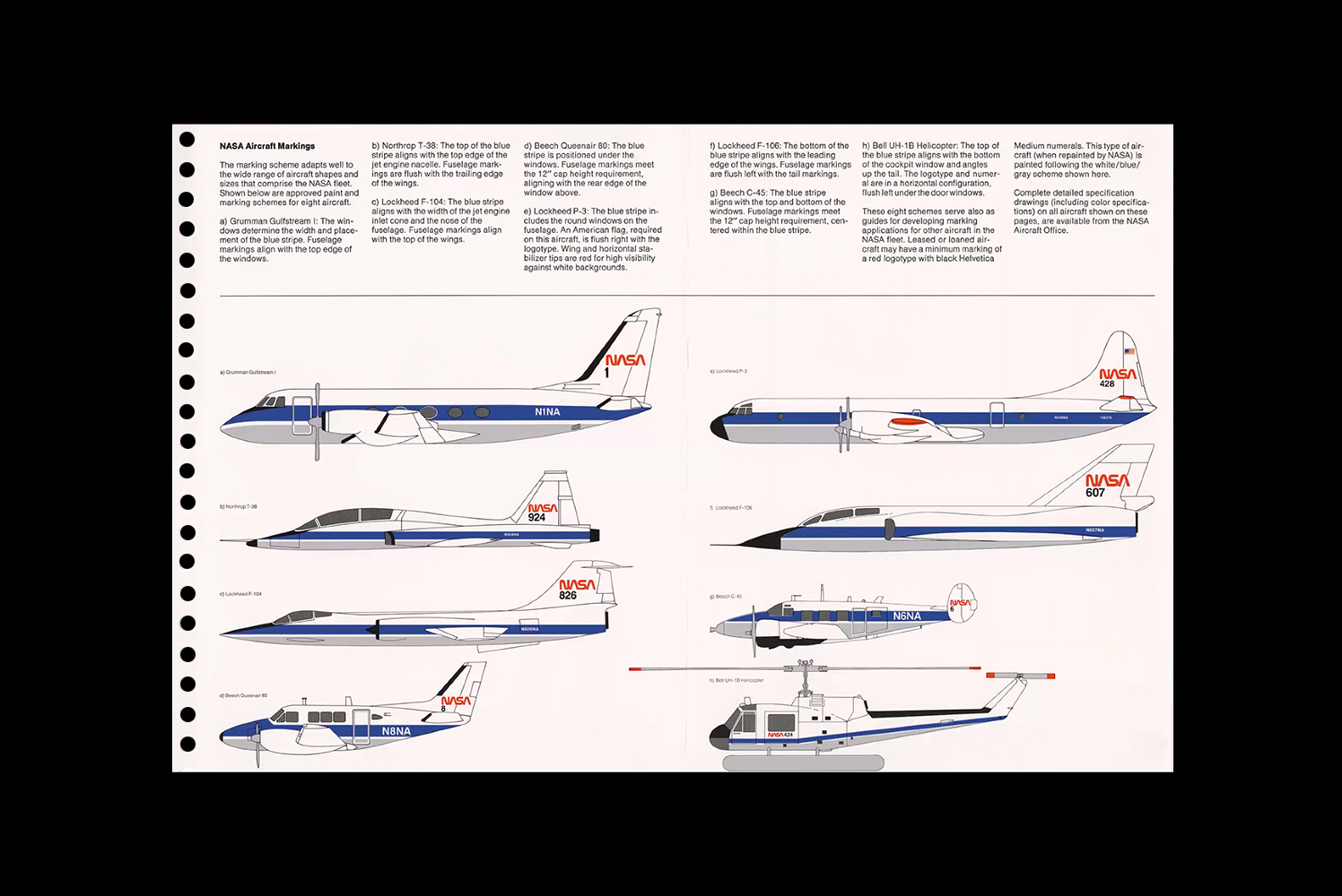
Here are select images from Richard’s presentation.
Brian Collins is the Chief Creative Officer of COLLINS.